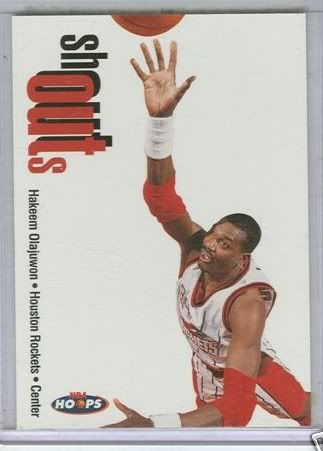
Sometimes you may like a card because it has an autograph. Or maybe it has a piece of memorabilia. Or it has chrome or foil printing. Or maybe it is a refractor. Or over the top graphics. But sometimes a card is great due to its simplicity such as the 1998 Hoops Shout Outs #22 featuring Hakeem Olajuwon.
First you start with a good photograph from an interesting angle. Second you use a simple card design. Instead of using excessive graphics, the underutilized technique of using white space doesn't detract from the photograph. Instead it enhances the picture. Finally using a simple, understated font completes the less is more theme of the design.
My only problem with this card is the little "sh" and the large "out." The text appears to spell shouts instead of shout outs. That's a minor flaw in an otherwise great looking card.