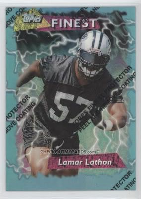
Today's card is the 1995 Finest Refractors #188 featuring Lamar Lathon.
So what don't I like about this?
1) Most obviously, the protective cover. OK, so you have a cover that keeps these more expensive in better shape, but the cover is ugly and detracts from the card. It's like putting a plastic seat cover over a nice couch. And of course you can't remove the cover to see how nice the card really looks because you'll ruin the value of the card.
2) The design. Just compare this to the Ultra card from the last post. The photograph quality is much worse. But that's OK. The picture isn't really the focus anyway. Instead you have lightning bolts and garish colors distracting you from the picture.
3) Refractors. There's nothing inherently wrong with refractors. I prefer a quality photograph over a tricked up picture, but I can see the appeal. The biggest negative of refractors is the later use of it. Instead of having just one refractor variation, today there's a whole rainbow of refractors. On top of the base refractor, you have blue, green, red, orange, purple, white, etc. Then you add the superfractor and xfractor which blurs and distracts from the picture even more.
But that's just my opinion. Some people love them and Finest was very popular. It's just not for me.


No comments:
Post a Comment